Frame colour changes contrast — how much the glasses separate from the skin and stand out on the face — and it changes how loud or quiet a shape reads. A black square frame and a caramel-tortoiseshell version of the same shape can look like two different pieces of eyewear, even though the outline hasn’t moved at all.
Why does the same shape look different in a different colour?
Shape sets the outline. Colour sets the contrast between that outline and the face wearing it. A dark frame against fair skin creates a hard edge that reads immediately; the same outline in a mid-tone tortoiseshell or a translucent crystal softens that edge and lets the shape sit more quietly. Nothing about the geometry has changed — only how sharply it’s announced.
This is why two people can try on the identical shape from the frames & styles archive and come away with completely different impressions of it. The frame hasn’t changed. The contrast between frame and face has.
Does dark frame colour always make a shape more dramatic?
Generally yes, but the effect depends on how much of the face the frame already covers. On a shape that’s already assertive — a heavy square or rectangular outline, an angular geometric frame — black or deep tortoiseshell compounds the effect. On something already restrained, like a fine wire aviator, a dark colourway can be the only thing making it register as a “frame” at all rather than disappearing into the face.
Colour and scale work together, not separately. This is worth thinking about alongside the frame’s actual size on the face — see how proportion behaves in this piece on oversized frames and face proportion — because a large dark frame and a large pale one are not equivalent statements.
What does tortoiseshell actually do that solid black doesn’t?
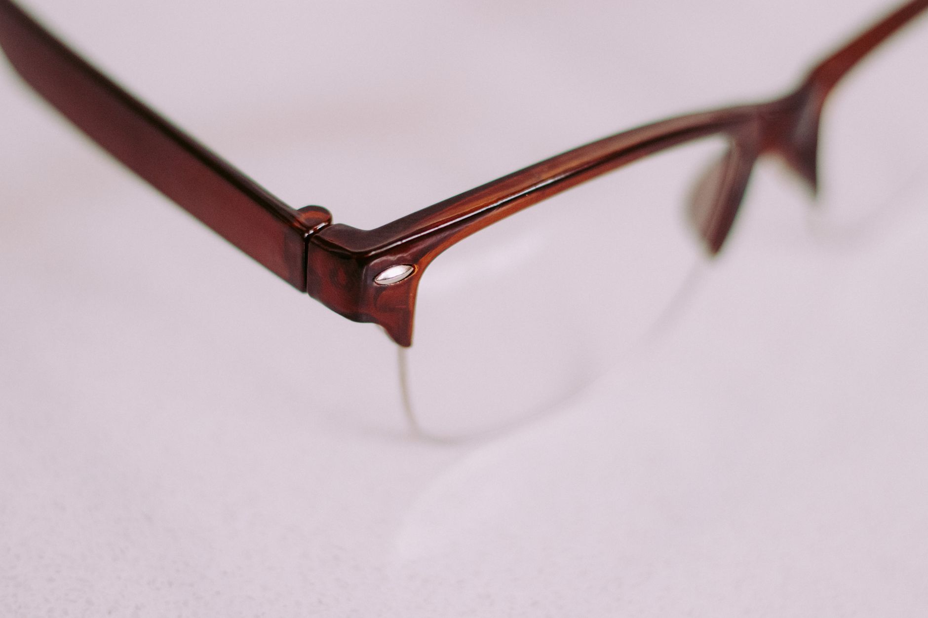
Tortoiseshell breaks the outline up with variation in tone, so the eye doesn’t register one continuous hard line the way it does with solid black. It reads as warmer and less severe, and it tends to sit more comfortably against a wider range of hair and skin tones because it isn’t asking to match anything — it’s already several colours at once.
This is part of why tortoiseshell has stayed a default option across decades of eyewear rather than a trend. It’s not neutral in the way beige is neutral; it’s neutral in the way it avoids committing to a single hard colour statement. On a classic rounded shape like a panto frame or a cat-eye, that softness can be the difference between a frame that looks considered and one that looks costumey.
Does clear or crystal acetate read as “no frame”?
Not quite no frame — more like a frame that lets the shape do the talking without the colour adding volume. Crystal and translucent acetates reduce contrast dramatically, which is useful on a shape that’s already strong or oversized and doesn’t need extra emphasis. It’s a different decision from choosing a rimless or half-rim construction, where the material itself is reduced rather than just lightened — worth comparing directly in this breakdown of full rim, half rim and rimless construction.
Crystal frames also behave differently under different light — they can look almost colourless indoors and pick up warm or cool undertones outdoors, which is a genuinely visual property of the material, not a marketing claim.
How does metal frame colour change the read, compared with acetate?
Metal introduces a second variable that acetate doesn’t have: reflectivity. Gold-tone and silver-tone metals catch light and draw the eye to the brow and temple line even at a small scale, which is part of why a fine aviator can look far more present than its actual size would suggest. Gunmetal and matte black tones behave more like dark acetate — they absorb rather than reflect, and read as quieter even in a comparable weight of metal.
Warm metals (gold, rose gold, antique brass) tend to sit well against warm skin undertones and dark or warm hair; cool metals (silver, chrome, gunmetal) do the same against cooler undertones. This is a styling convention worth knowing, not a rule to follow rigidly — plenty of people look better deliberately working against it, wearing silver against warm colouring for the contrast rather than the match.
Is there an actual rule for matching frame colour to skin tone?
There’s a widely repeated convention rather than a rule: warm colouring pairs with warm frame tones (tortoiseshell, gold, brown, olive) and cool colouring pairs with cool tones (black, silver, grey, navy). It’s a reasonable starting point for someone choosing between two otherwise similar frames, and it’s entirely fair to ignore it. A cool black frame on warm colouring reads as sharp and deliberate, not wrong — it’s a different statement, not a mistake.
The more useful test in person is simpler than any undertone chart: hold the frame near the face in daylight, not shop lighting, and look at whether it makes the skin look brighter or duller. That’s the actual mechanism the convention is trying to describe.
Does frame colour change how a bridge or hardware detail reads?
Yes — small structural details become more or less visible depending on the colour around them. A contrast-colour double bridge or a saddle bridge in a tone that differs from the rest of the frame draws attention to the nose bridge area specifically, which can be a deliberate design choice or an unwanted distraction depending on the face it’s on. A keyhole bridge cut from the same colour as the front tends to disappear into the shape; picked out in a different tone, it becomes a visible design feature.
This is also where it’s worth checking the small numbers stamped inside the temple — the frame width and bridge measurements explained in this guide to the numbers inside a glasses frame matter more to fit than colour ever will, and colour choices are easiest to make once fit is already settled.
Does frame colour matter more when the lenses are tinted?
The frame colour and the tint are two separate decisions, and it’s worth keeping them separate in the mind even when shopping for both at once. Frame colour is entirely a matter of how the eyewear reads visually. Tint is not — and a dark lens is not sun protection by itself.
A dark tint with no stated UV filter can be worse than wearing no sunglasses at all, because the darkness makes the pupil open wider while doing nothing to block ultraviolet light, letting more of it reach the eye. Protection comes from a labelled UV filter — look for UV400 or a stated 100% UVA/UVB protection — not from how dark the lens looks, and not from the price of the frame around it. Frame colour can be chosen purely on how it looks; tint has to be chosen on what it’s rated to do.
Does frame colour affect how “blue-light” or screen lenses are perceived?
Not really, and it’s worth being straightforward about the underlying claim while colour is under discussion. Blue-light filtering coatings are usually sold on clear or lightly tinted lenses regardless of frame colour, and the evidence that they meaningfully reduce eye strain from screens is thin — the marketing has moved well ahead of what’s actually been demonstrated. Frame colour has no bearing on whether such a coating does anything; that’s a lens question, not a styling one, and it’s genuinely worth raising with an optician rather than deciding from a product page.
What’s the practical way to choose a frame colour?
Settle the shape and proportion first, then let colour adjust the volume up or down rather than treating it as a separate decision made in isolation.
- Choose the shape and scale against face proportion first — colour can’t fix a fit problem.
- Use a dark or solid tone to make a shape read more deliberately.
- Use tortoiseshell, crystal or a mid-tone to soften a shape that already feels strong.
- Treat skin-tone matching as a starting convention, not a rule.
- Judge colour in daylight against skin, never under shop lighting alone.
None of this changes what the lenses need to do for actual vision — that’s a conversation for an optician, not a styling choice. But how the frame reads on the face, before anyone even notices the shape, is largely a question of colour.
The Designer Glasses publishes general information and style opinion, not professional advice. We are writers and enthusiasts, not opticians, optometrists or dispensing opticians. Nothing here interprets a prescription, recommends a lens power, or tells you whether you need correction — only an eye examination can do that. If your vision changes suddenly, or you have eye pain, flashes, new floaters or halos around lights, treat it as urgent and contact an eye care professional the same day. Sunglasses should carry a stated UV rating: a dark lens without UV filtering is worse than none at all.