Clear and translucent frames look different on everyone because the frame stops supplying its own colour and starts borrowing it — from skin tone, hair colour, eye colour, the light in the room, even a shirt underneath. A solid black frame overrides all of that. A clear one doesn’t, which is exactly why it never reads the same way twice.
Why does the same clear frame look different on different faces?
A pigmented frame sits on top of the face as a shape. It has its own colour value regardless of what’s behind it, so a tortoiseshell frame reads roughly the same on most people — warmer or cooler depending on skin undertone, but recognisably itself.
A clear or translucent frame doesn’t have that fixed value. Light passes through the material and picks up whatever is behind it — the wearer’s skin, the wall behind them, the colour of their hair falling near the temple. The frame becomes a lens for colour as much as for vision, and that’s a genuinely different visual job than an opaque frame is doing.
What does “clear” actually mean in a frame material?
Most clear frames are acetate or a similar cellulose-based plastic, cast or cut without pigment added, or with only a faint tint left in. Some are polycarbonate or a lighter co-polymer, used for a more crystalline, almost glass-like finish. The material itself has very little colour of its own — it’s mostly transmitting or scattering whatever light hits it.
This is different from a “crystal” or “smoke” frame, which has pigment mixed in at a low concentration rather than none at all. A true clear frame is closer to a window; a smoke or crystal frame is closer to tinted glass. Both behave less predictably than a solid colour, but a genuinely clear frame is the most sensitive of the three to what’s around it.
Does skin tone change how a translucent frame reads?
Yes, and this is the single biggest reason the same pair looks different on two people. A clear frame held against deeper skin will pick up warmth from that skin and read amber, honey or faintly rose depending on the light. Held against paler or cooler-toned skin, the same frame can look almost colourless, or take on a slightly grey, glassy cast instead.
Neither is more correct. It’s the same physical effect that makes a clear glass of water look different depending on the tablecloth under it. The frame isn’t changing — the light bouncing through it is.
Why do clear frames sometimes look cheap and sometimes look expensive?
This usually comes down to thickness, edge finish and how the material was cast, not the fact that it’s clear. A thin, unevenly polished clear frame can look like a plastic sample tag. A thicker, well-finished clear or crystal acetate — with rounded, hand-polished edges and no visible mould lines — reads as considered and a little architectural instead.
Clear material hides nothing. Tool marks, sink lines from the moulding process, and cheap hinge hardware are all far more visible through a clear or translucent frame than they would be under solid black or tortoiseshell. It’s worth comparing edge finish and hinge quality specifically when judging any pair — a habit that’s useful across every material, not just clear ones, and something the frames and styles archive covers in more depth for other shapes and finishes.
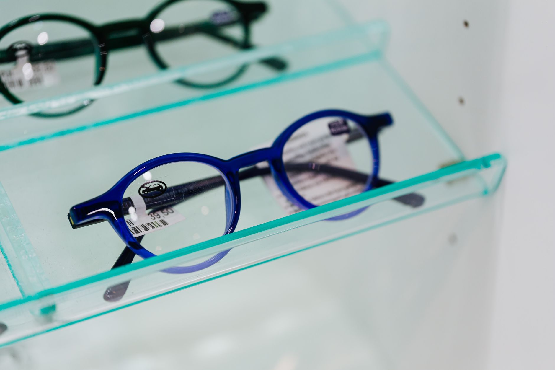
Does frame shape matter more with clear acetate?
Shape carries more of the visual weight when colour isn’t doing much work, so getting the outline right matters more with a clear frame than with a solid one. A strong, well-defined shape — a proper square or rectangular outline, a rounded panto, a geometric cut — gives the eye something definite to read, since the material itself is offering very little contrast against the face.
A shapeless or overly soft clear frame can disappear on the face entirely, reading as “glasses-shaped fog” rather than a considered design choice. This is also where scale matters: an oversized clear frame has to earn its size through shape and proportion, because it isn’t getting help from a bold colour to anchor it.
Rim construction plays into this too. A full rim in clear acetate reads very differently from a half-rim or rimless version in the same material — the amount of visible frame changes how much “clear” there actually is to notice. The distinctions are laid out in full rim, half rim and rimless: the real difference, and they matter more, not less, once colour is out of the equation.
Do clear frames suit every face shape?
As a starting convention: clear and translucent frames tend to soften strong jawlines and wide-set features because they don’t add a hard colour block to the face, and they can make angular shapes like a geometric frame feel lighter to wear day to day. That’s a styling opinion, not a rule, and plenty of people override it deliberately.
A rounder, softer face sometimes benefits from the opposite approach — a clear frame with a stronger, more angular outline to add definition that a solid dark colour would otherwise provide. There’s no single correct pairing here; it’s worth trying both directions rather than assuming one face shape is locked out of the look.
Does the colour underneath the frame change on purpose, or is it random?
Some of it is intentional design, not accident. Many clear and translucent frames are cast with a very faint undertone — a hint of grey, amber, pink or green — specifically because the designer knows that undertone will shift depending on skin and light, and wants a particular range of outcomes rather than a truly neutral, colourless result.
This is a related idea to how any frame colour interacts with a face, just more pronounced. The general logic of how pigment and undertone change the read of a pair of glasses is covered in what frame colour changes about how glasses read, and most of that reasoning applies here — just amplified, because clear material has nowhere to hide its interaction with skin and light.
What about clear or translucent sunglasses — is the tint different?
A clear or lightly tinted sunglass lens is not the same thing as a clear frame front. The frame’s transparency is a styling detail. The lens’s job, if it’s genuinely a sunglass, is UV protection — and that protection comes from a stated filter, not from how dark or light the lens looks.
A translucent or lightly tinted lens with no stated UV rating can be worse than wearing no sunglasses at all, because a tinted lens causes the pupil to open wider while doing nothing to block UV, letting more of it reach the eye. Look for UV400 or a stated 100% UVA/UVB filter on the lens itself or its documentation — never judge protection by tint depth, and never by price.
How to judge a clear frame in the shop, not just at home
Store lighting is rarely neutral, so a clear frame can look noticeably different under warm shop halogens than under daylight or the cooler light of a bathroom mirror at home. It’s worth stepping toward a window or natural light source before deciding, since that’s closer to how the frame will actually read day to day.
- Check the frame against bare skin near a window, not just under shop lighting.
- Look at edge finish and hinge hardware closely — clear material hides flaws less than any pigmented colour.
- Consider the outline and rim style deliberately, since shape is doing more visual work than colour here.
- If it’s a sunglass version, confirm a stated UV rating rather than judging by how dark the lens looks.
Small stamped details inside the temple — often a model number alongside material and size codes — can also help when comparing a clear frame across retailers or trying to find the same cast elsewhere; what those markings mean is explained in what the numbers inside a glasses frame mean. None of it interprets a prescription — for anything to do with lens power, coatings that apply to a specific prescription, or genuine eye symptoms, that conversation belongs with an optician, not a style guide.
The Designer Glasses publishes general information and style opinion, not professional advice. We are writers and enthusiasts, not opticians, optometrists or dispensing opticians. Nothing here interprets a prescription, recommends a lens power, or tells you whether you need correction — only an eye examination can do that. If your vision changes suddenly, or you have eye pain, flashes, new floaters or halos around lights, treat it as urgent and contact an eye care professional the same day. Sunglasses should carry a stated UV rating: a dark lens without UV filtering is worse than none at all.