What is the difference between a men’s and a women’s frame, really?
Mostly, it’s sizing convention, colour range and hardware detailing — not anatomy. Frames labelled “men’s” tend to run larger and heavier in materials; “women’s” tend to run smaller with more decorative bridges and colour options. Face shape, not gender, is what actually determines whether a frame suits someone.
There’s no regulation behind the labels. A manufacturer decides which shapes go into which line, and the decision is based on decades of retail habit more than anything measurable about how men’s and women’s faces differ. Plenty of faces sit outside whatever average the label was built around, which is exactly why the labels are worth questioning rather than following blindly.
Is the difference really about size?
Largely, yes — but it’s an average, not a rule. Frames marketed to men skew wider across the front and have longer temples, on the assumption of a broader face and longer temple-to-ear distance. Frames marketed to women skew narrower, on the same kind of assumption in reverse.
The problem is that averages hide a huge amount of overlap. Plenty of men have narrower faces than the “men’s” range assumes, and plenty of women have wider ones. This is where the numbers printed inside the temple arm become genuinely useful — they tell you the actual lens width, bridge width and temple length of the pair in your hand, regardless of which section of the shop it came from. It’s worth learning what the numbers inside a glasses frame mean before trusting a label over a measurement.
Does frame colour separate men’s and women’s styles?
Colour is where the split is most visible on a shop floor, but it’s the least fixed part of the divide. Men’s ranges lean toward black, tortoiseshell, gunmetal and navy; women’s ranges bring in a wider spread of colour, including translucent tones, pastels and warmer finishes.
None of that is inherent to the shapes underneath. A round frame in black reads differently from the same round frame in a soft amber, and that’s a colour effect, not a gendered one. It’s worth understanding how frame colour changes how glasses read before assuming a shape is off-limits just because the sample on display came in a colour aimed elsewhere.
Translucent and crystal frames are their own case. Because the material itself carries the tone rather than an opaque colour coat, the same frame can look completely different depending on skin tone and lighting — which is why clear and translucent frames look different on everyone, regardless of which section they were shelved in.
What about shape — are certain shapes “for” men or women?
Not structurally, no. Styling convention has attached some shapes to one gender more than the other, but that’s history and marketing, not anything about the shape itself. This is our opinion, and it’s one worth ignoring when it doesn’t suit the face in front of you.
Some patterns worth knowing, purely as convention rather than rule:
- The cat-eye frame has carried a feminine association since the 1950s, but its upswept corner works on any face that wants more width at the brow.
- The aviator frame was designed for pilots, not for one gender, and its teardrop shape suits a narrow face regardless of who’s wearing it.
- The browline frame reads as classically masculine largely because of mid-century advertising, not because the heavy top bar behaves differently on a man’s face.
- A round frame has no gendered history at all — it’s simply been photographed on certain faces more than others.
The shapes that get treated as “unisex” — the wayfarer frame, the panto frame, the P3 frame — earned that status by being simple enough in outline that colour and size do the differentiating instead of the shape itself.
Do materials and hardware differ between men’s and women’s frames?
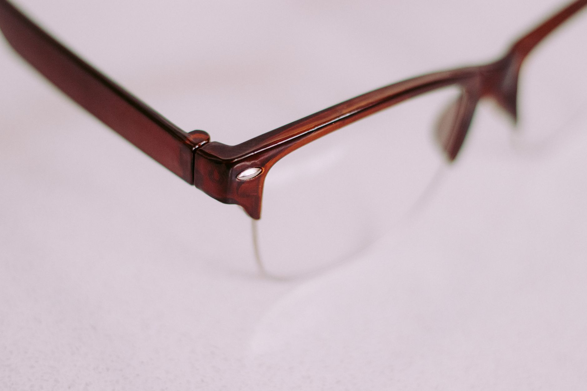
Sometimes, at the level of detail rather than the level of the frame’s basic construction. Men’s frames more often use thicker acetate or heavier metal, with plainer, more industrial hinges. Women’s frames more often bring in slimmer profiles, decorative bridge work and finer metal detailing.
Bridge style is a good example of where this shows up. A double bridge reads as more utilitarian and turns up more often in frames marketed to men, while a saddle bridge — which sits differently on the nose entirely — appears across both. A keyhole bridge solves a fit problem on a narrow nose and has nothing to do with gender at all, though it’s marketed more toward vintage-inspired men’s styles.
None of these details are exclusive by design. They’re exclusive by marketing convention, which means a frame with delicate hardware and a heavier lens shape is entirely reasonable, whatever section it’s filed under.
Why do unisex frames exist, and how are they different?
Unisex frames aren’t a third category built on different rules — they’re frames whose proportions and colours sit close enough to the middle of both ranges that they read as appropriate either way. The construction underneath is identical to any other frame.
What tends to make a frame land as unisex:
- A mid-range width and lens size, avoiding both the widest “men’s” and narrowest “women’s” extremes
- Colours pulled from the overlap — black, tortoiseshell, clear, grey — rather than either extreme of the palette
- A simple outline, like a wayfarer or panto shape, where the geometry doesn’t carry a strong gendered association to begin with
Full rim, half rim and rimless construction cut across all of this in exactly the same way. Choosing between them is a question of how much frame you want visible on the face and how the lens is held in place — it has nothing to do with which section of a shop the frame was sold in, as the real difference between full rim, half rim and rimless makes clear.
Should you buy from the “wrong” section if the frame fits better?
Yes, without hesitation. The label on the display stand is a retail habit, not a measurement of your face. What matters is whether the frame’s width, bridge fit and proportion suit the face wearing it — and those things are printed inside the temple, not decided by which aisle the frame came from.
A useful way to think about proportion, regardless of label, is what happens at the edges of a shape. Oversized frames genuinely change facial balance by adding visible frame at the brow and cheek — that’s what an oversized frame does to your proportions, and it applies exactly the same way whether the frame was displayed as men’s or women’s. The same is true comparing a squared-off shape to a rectangular one — the real difference between square and rectangular frames is about jaw and cheekbone proportion, not gender. And a strongly angular shape, like the ones covered in who actually suits geometric frames, either sits well against a face’s existing lines or it doesn’t — the label has no bearing on that outcome.
Face-shape guidance of this kind is a styling convention, not a rule with any science behind it. Plenty of people look better in a shape the convention says to avoid. The gendered labelling on frames deserves exactly the same scepticism: useful as a starting filter in a shop, not a boundary worth respecting once a frame is actually on the face. For a broader look at how different shapes behave on different faces, the frames and styles archive is the better place to start than any men’s or women’s display.
The Designer Glasses publishes general information and style opinion, not professional advice. We are writers and enthusiasts, not opticians, optometrists or dispensing opticians. Nothing here interprets a prescription, recommends a lens power, or tells you whether you need correction — only an eye examination can do that. If your vision changes suddenly, or you have eye pain, flashes, new floaters or halos around lights, treat it as urgent and contact an eye care professional the same day. Sunglasses should carry a stated UV rating: a dark lens without UV filtering is worse than none at all.