1950s frame shapes keep returning because they solved a genuine design problem — how to make a face look more structured and alert without exaggeration — and that problem hasn’t gone away. Cat-eye, browline and thick round shapes flatter a wide range of faces, which is why every generation rediscovers them rather than replacing them.
What actually counts as a “1950s frame shape”?
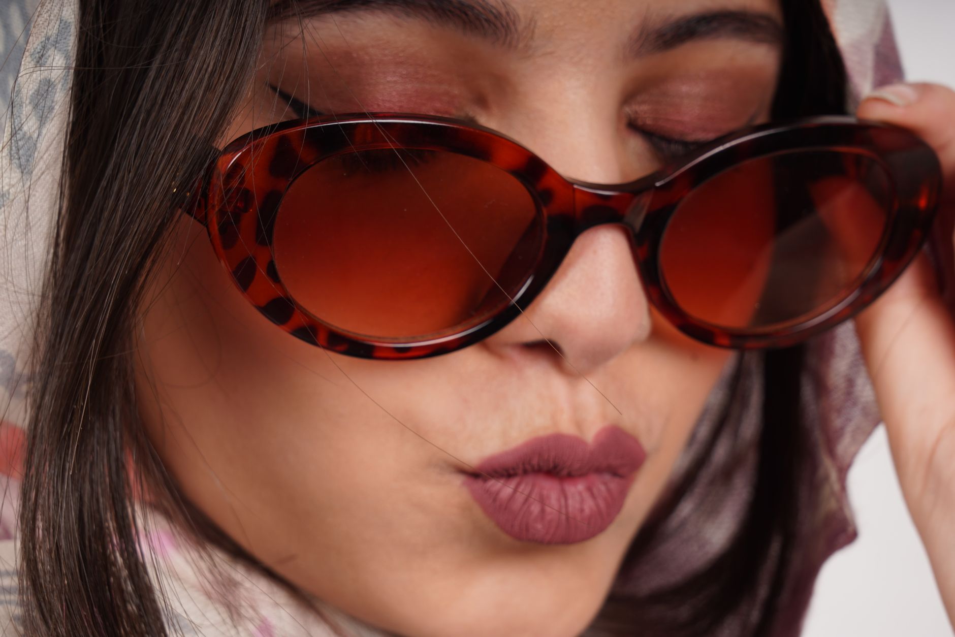
Three shapes dominate the era and account for most of what gets called “vintage” today. The cat-eye, with its upswept outer corners, the browline, where a heavier acetate top sits over a thinner metal bottom rim, and a chunky round or slightly panto shape usually made in thick, often two-tone acetate.
What ties them together isn’t a single silhouette but a shared attitude toward proportion: strong horizontal lines, deliberate contrast between top and bottom, and frames sized to be noticed rather than to disappear on the face. That’s a real departure from the wire-thin, minimal frames that had come before.
Why do these shapes suit so many faces?
The browline and cat-eye both do the same visual job — they add width and definition at the brow and cheekbone, which reads as structure. On faces that are longer, softer, or lacking strong natural angles, that added horizontal line does a lot of flattering work without the frame needing to be dramatic in outline.
This is a styling convention, not a scientific rule — plenty of faces look sharper in a rounder, softer 1950s shape than a face-shape chart would predict, and the “opposite” pairing often works better than the textbook one. The archive on face shape and fit goes into this in more depth, and it’s worth reading with a healthy amount of scepticism toward any rule presented as fixed.
Is this nostalgia, or something about proportion?
Nostalgia explains why a shape gets revived once. It doesn’t explain why the same handful of shapes come back every decade, across completely different cultural moments. What repeats is the underlying geometry: a browline sits at a proportion that echoes an eyebrow, and a cat-eye’s upswept corner echoes the outer corner of an eye. Both shapes flatter because they exaggerate a line the face already has, rather than fighting it.
Compare that to some 1990s or early-2000s shapes — very small, very round, very rimless — which relied on being unobtrusive rather than flattering. Those trends resurface too, but less often and for shorter windows, because they depend more on a specific cultural mood than on a proportion that consistently works on faces.
What materials made the 1950s look possible?
Thick, saturated acetate was central to the period, partly because manufacturing had just caught up with what designers wanted to do. Layered and laminated acetate let makers put a tortoiseshell top over a solid colour underneath, or build the kind of two-tone effect seen on classic browlines. That technique still exists — it’s explained properly in this piece on laminated acetate frames — and it’s a large part of why the originals have that particular depth of colour that modern injection-moulded plastic struggles to fully replicate.
Metal browline bottoms were typically a nickel alloy or, later, a more corrosion-resistant option, often joined to the acetate top with a small rivet rather than a moulded hinge post. That construction detail — covered in this explainer on rivet hinges — is one of the clearest tells between an original 1950s pair and a modern reissue, and it’s still used by makers who want that specific look and feel rather than pure convenience.
How do modern versions differ from the originals?
Materials have moved on, and not always for the worse. Some vintage frames from the period were made in optyl, a material collectors still specifically look for because of how it ages — it’s covered in detail in this piece on optyl — while modern reissues are more often standard cellulose acetate, which behaves differently over decades of wear.
Lens technology has also changed the proportions available. A 1950s cat-eye was cut for glass lenses, which limited how large or how curved a frame could sensibly be. Modern reissues are cut for lighter plastic lenses, so designers can push the shape slightly larger or more curved than the original while keeping the frame comfortable — which is part of why a “1950s-inspired” pair today often reads bolder than anything actually worn in 1958.
Colour has shifted too. Original palettes leaned on tortoiseshell, black, and a handful of muted pastels achievable with the dyes of the time. Reissues use the same shapes as a canvas for far more saturated or unusual colourways, because acetate colouring has simply advanced. The materials and craft archive is a useful place to see how much of what looks like “vintage colour” is actually a modern technique dressed in an old silhouette.
Is it worth buying an actual 1950s frame rather than a reissue?
It depends on what’s being bought for — look, or object. An original frame carries construction details a reissue can’t fully copy, but it also carries fifty-plus years of wear on the hinges, the temples, and the acetate itself.
- Check the hinge and any rivets for looseness rather than just cosmetic wear.
- Look closely at the acetate for surface cracking or a slightly sticky, sweet smell, which can indicate the material is breaking down.
- Confirm the lenses can actually be re-glazed to a current prescription in that frame, rather than assuming it.
This guide to buying vintage or second-hand frames covers the specifics in far more detail than a styling article should, and it’s worth reading in full before paying vintage prices for something that turns out to need more restoration than it’s worth.
What should you actually compare when shopping the look today?
Whether the frame is an original, a licensed reissue, or a completely new interpretation of the shape, the same things determine whether it will actually work day to day: how the proportion sits against your own face width, how the acetate or metal is finished, and how the hinge is built rather than just how it looks in a photo.
The frames and styles archive is a good place to see how these 1950s shapes sit alongside other eras, and the hub on choosing glasses and sunglasses lays out the fuller list of what to compare — proportion, construction, and material — before deciding between two frames that look similar on a shelf but aren’t built the same way underneath.
A shape returning from the 1950s is a compliment to the original design, not a guarantee that any version of it will suit any face. The proportion is the part worth trusting; everything else — colour, material, exact construction — is worth judging on the frame actually in front of you.
The Designer Glasses publishes general information and style opinion, not professional advice. We are writers and enthusiasts, not opticians, optometrists or dispensing opticians. Nothing here interprets a prescription, recommends a lens power, or tells you whether you need correction — only an eye examination can do that. If your vision changes suddenly, or you have eye pain, flashes, new floaters or halos around lights, treat it as urgent and contact an eye care professional the same day. Sunglasses should carry a stated UV rating: a dark lens without UV filtering is worse than none at all.